
Site style
Your site style sets the look of every section at once: cards, buttons, photos, headings, and icons, plus your menu, footer, and built-in pages. Change it and the whole site follows.
Open the Site tab in the panel.
Theme, fonts, and colours
Under Theme:
- Light or Dark. Sections, cards, forms, the menu, and the footer follow the theme unless you’ve given them their own colours.
- Heading font and Body font. Text uses these unless you pick a font for some text in the text toolbar.
- Shrink large text on phones: big headings get smaller on phones so they fit. Check it in the phone view.
- Brand color: used for buttons, links, and accents across your site. You can give one section its own accent colour.
- Page background: leave it blank to follow the theme.
Pick a site style
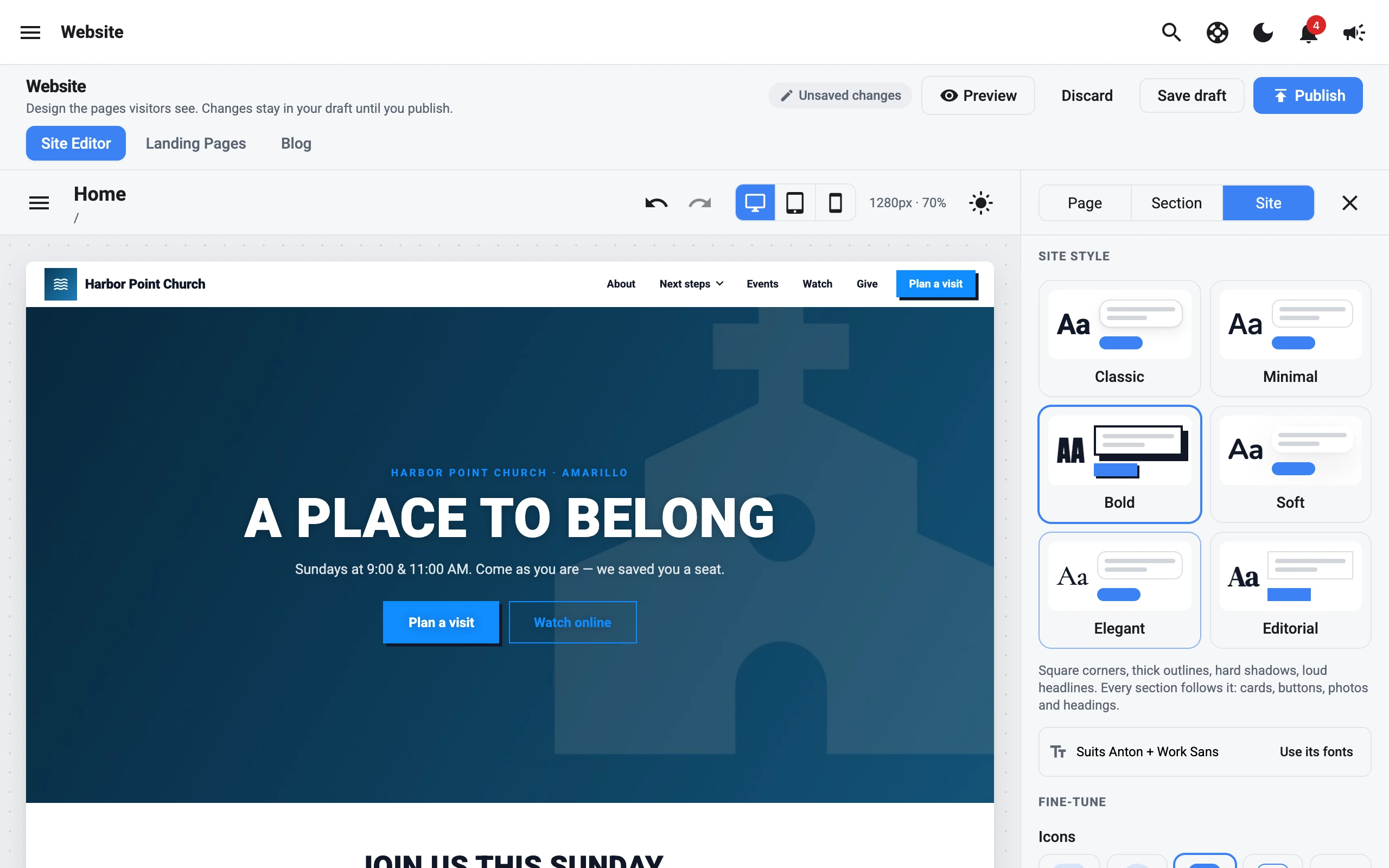
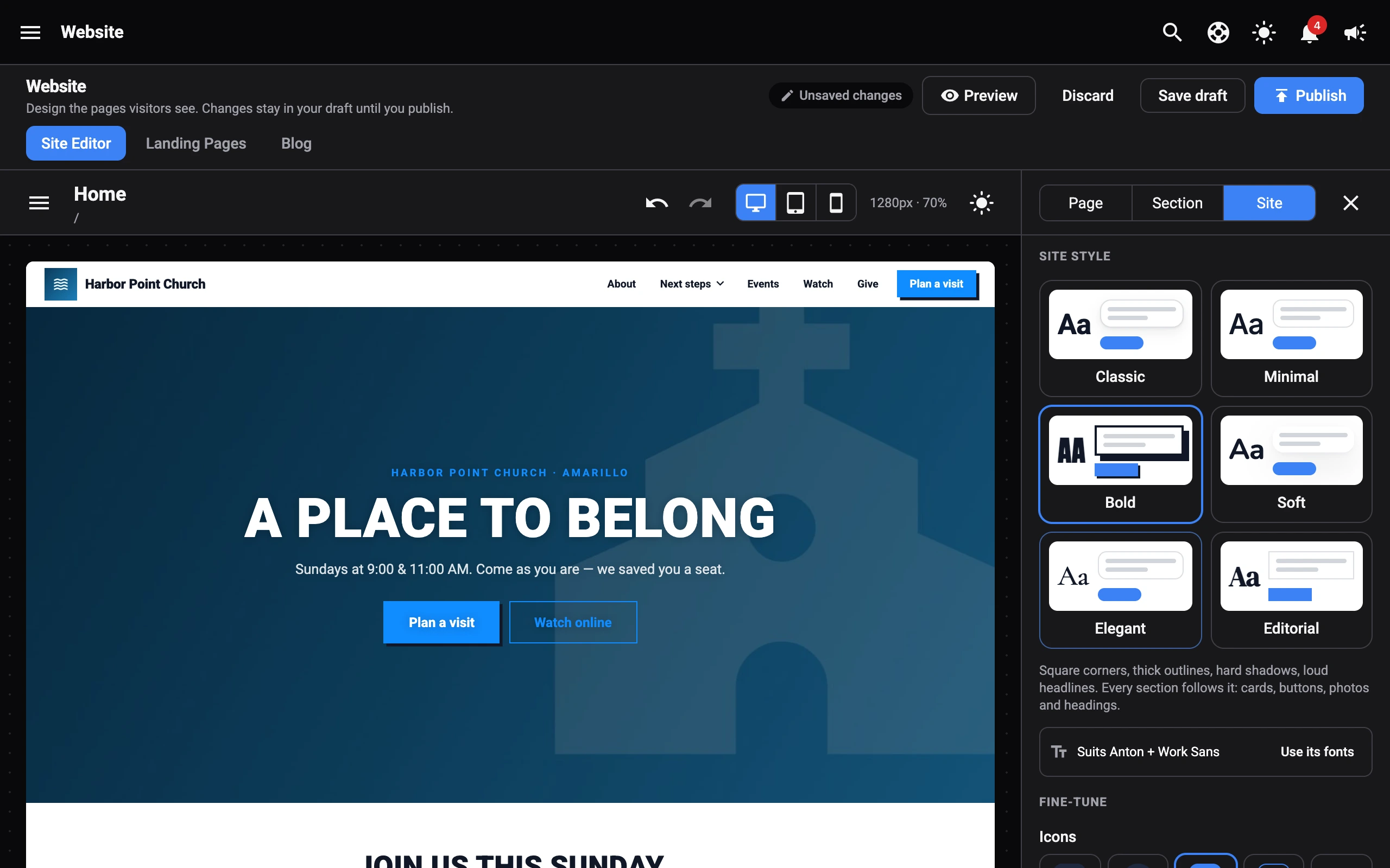
Under Site style, pick one of six looks. Each card shows a small preview.
| Style | What it looks like |
|---|---|
| Classic | Rounded cards, gentle shadows. The original look. |
| Minimal | Hairlines, no shadows, lots of white space. |
| Bold | Square corners, thick outlines, hard shadows, loud headlines. |
| Soft | Big round corners, no outlines, floating cards. |
| Elegant | Serif headings, fine lines, quiet corners. |
| Editorial | Oversized, tightly set headlines and crisp rules. |
Most styles come with fonts that suit them. Select Use its fonts to switch your heading and body fonts to match. Your fonts don’t change until you do.
Fine-tune
Under Fine-tune, change any part of the style:
- Icons: Tinted, Circle, Solid, Outline, or Plain. See Icons.
- Corners: Square, Small, Medium, or Round.
- Outlines: None, Thin, or Thick.
- Shadows: None, Soft, or Hard.
- Headings: Normal, Uppercase, or Tight.
- Heading weight: Light, Regular, Bold, or Heavy.
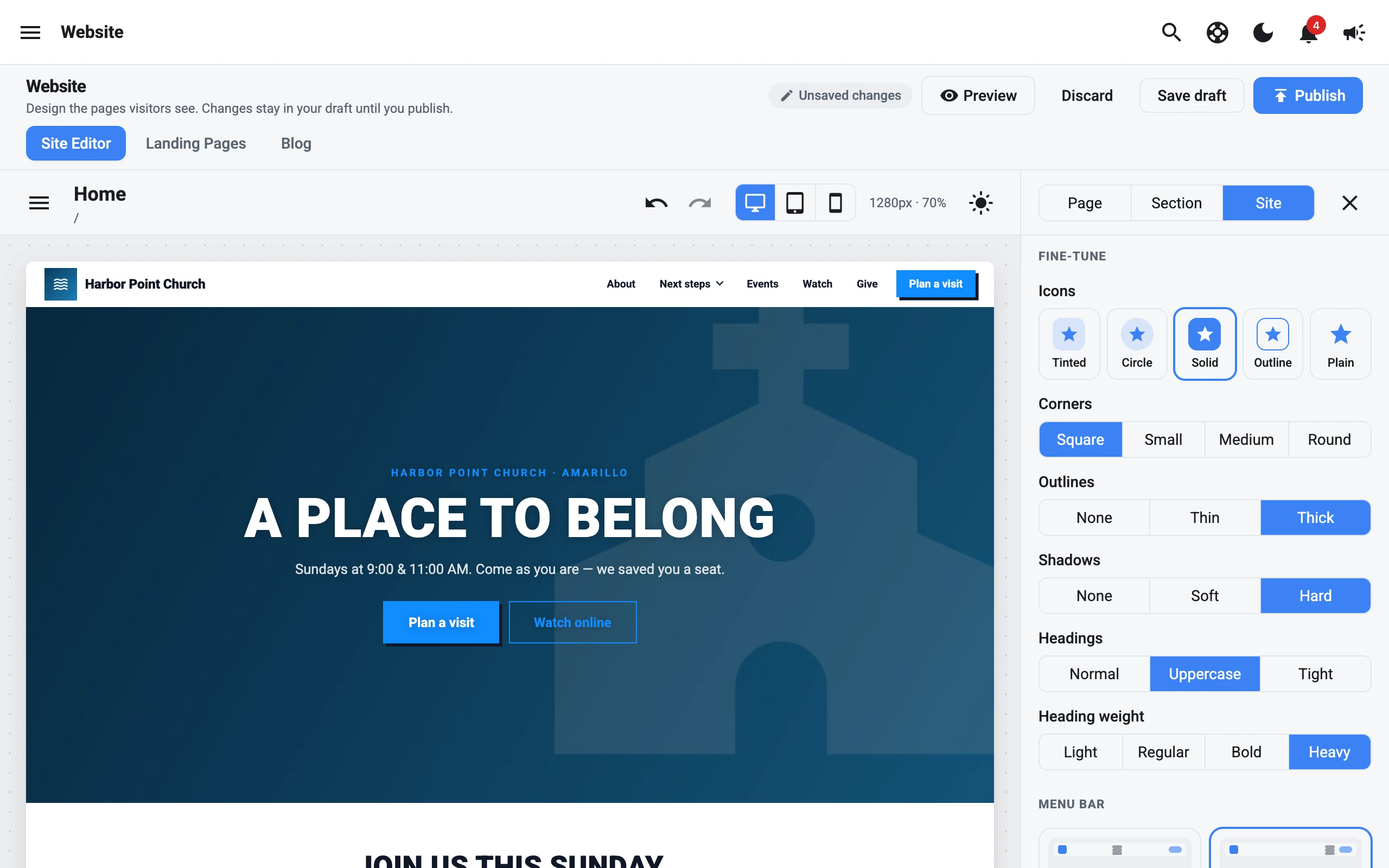
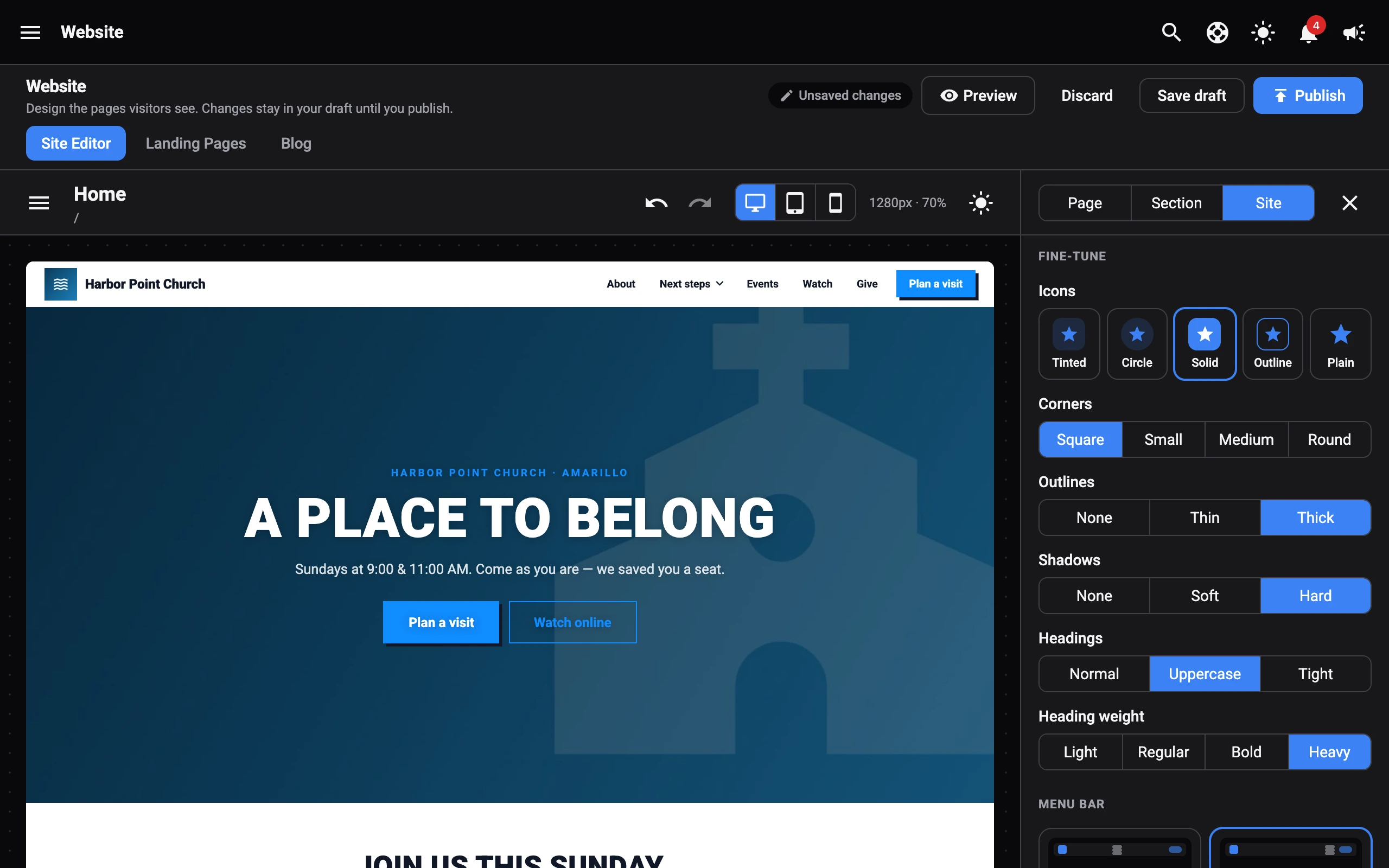
Select Reset to style name to go back to the style’s own settings. Picking a different style also starts fresh.
Icons
The icon style changes the badges behind icons in sections like Features, Service times, Contact us, and Giving, the icons in menu dropdowns, and the icon tiles on built-in pages.
- Tinted: a soft tint of your brand colour behind the icon.
- Circle: the tinted badge, made round.
- Solid: a brand-coloured badge with a white icon.
- Outline: an outlined badge with no fill.
- Plain: just the icon.
Features, Service times, and Contact us sections can have their own icon style. Pick one in the section’s Content tab, or leave it on Site to follow the site style.