
Sections
Select Add a section on a page and pick one from the list, or search for it. Sections are grouped the same way here.
Many sections have more than one look. Switch looks in the Content tab, or from the quick-style bar on the canvas. Every section also has a Style tab. See Style a section.
Text & layout
| Section | What it’s for |
|---|---|
| Section | A background (colour, image, or video) with 1–4 columns of anything. |
| Hero | A big banner with a headline and buttons. |
| Heading | A title with an optional eyebrow and subtitle. |
| Buttons | One or more buttons in a row. |
| FAQ | Questions with answers that open. Looks: Lines, Cards, Two columns. |
| Page nav | Links that jump to sections on this page. |
| Text | A block of rich text. |
| Columns | 1–4 columns of text, with optional icons. |
| Image + text | An image beside text, with an optional button. |
| Call to action | A headline block with one or two buttons. Looks: Centered, Left aligned, Banner, Image left, Image right, Overlapping. |
| Tabs | Tabbed groups of sections. |
| Divider | A horizontal line. |
| Spacer | Empty space. |
Hero
Type the eyebrow, headline, and subtitle right on the page. In Content you can set the background Image (and a separate Phone image), a background Video, the Height, the Text width, and a Tint over the background.
When you set a Tint strength, choose a Tint fade:
- Solid: the same tint everywhere.
- Left to right: darker behind left-aligned text, so the photo stays clear on the right.
- To bottom: fades towards the bottom of the hero.
Change the eyebrow’s colour with Eyebrow color, in Content or the quick-style bar.
Page nav
A row of links that jump to sections further down the page, like Our story, Beliefs, and Leadership.
- On each section you want to link to, open Style and give it a name under Link to this section.
- Add a Page nav and select Add a link for each one. Type the link text and choose the section.
Pick Underline or Pills, and an alignment. Turn on Stay under the menu while scrolling to keep it in view. The link for the section people are reading is highlighted as they scroll.
Media
| Section | What it’s for |
|---|---|
| Header image | A full-width banner image. |
| Header with text | A banner image with text on top. |
| Image | A single image. |
| Gallery | Photos in a Grid, Masonry, Mosaic, or Carousel. |
| Video | One of your uploaded videos. |
| YouTube | Embed a YouTube video or live stream. |
Highlights
| Section | What it’s for |
|---|---|
| Features | Ministries, values, or next steps with icons or photos. Looks: Cards, Centered icons, List, Photo cards. |
| Stats | Big numbers that tell your story. Looks: Plain, Cards, Divided, Brand band. |
| Timeline | Milestones in your story, in order. |
| App download | Your app: store buttons and screenshots in phone frames. |
| Testimonials | Stories and quotes from your people. Looks: Cards, Spotlight, Wall. |
| Scripture | A Bible verse, beautifully set. Looks: Centered, Card, Band, Split. |
| Social links | Your social media, as Icons, Buttons, or Cards. |
Features
Each item has an icon or photo, a title, and text. You can also give each item:
- A small line above the title, like Step 1.
- A line under the text, like John 3:16.
- A category, when filter chips are on.
Options:
- Number the items (01, 02, …): each item’s eyebrow shows its number, unless you type your own.
- Make the first item a tall photo card (Cards and Photo cards looks): the first item spans two rows with its text over the photo. Give it a photo.
- Filter chips by category: visitors can filter the items. Each category becomes a chip after All.
Pick the icon style for this section, or leave it on Site to follow your site style.
Stats
Turn on Small label above each value to put the label over the number instead of under it.
Timeline
Add a title, a subtitle, and milestones. Each milestone has a date (like 1998), an optional title, and what happened. Drag milestones to reorder them.
Pick a style: Across, Down, or Alternating. Every style runs down the left on phones.
App download
Show off your app with App Store and Google Play buttons and up to three screenshots in phone frames.
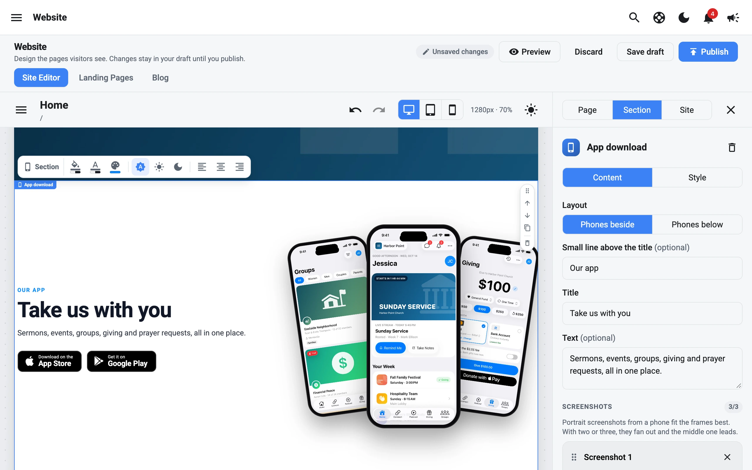
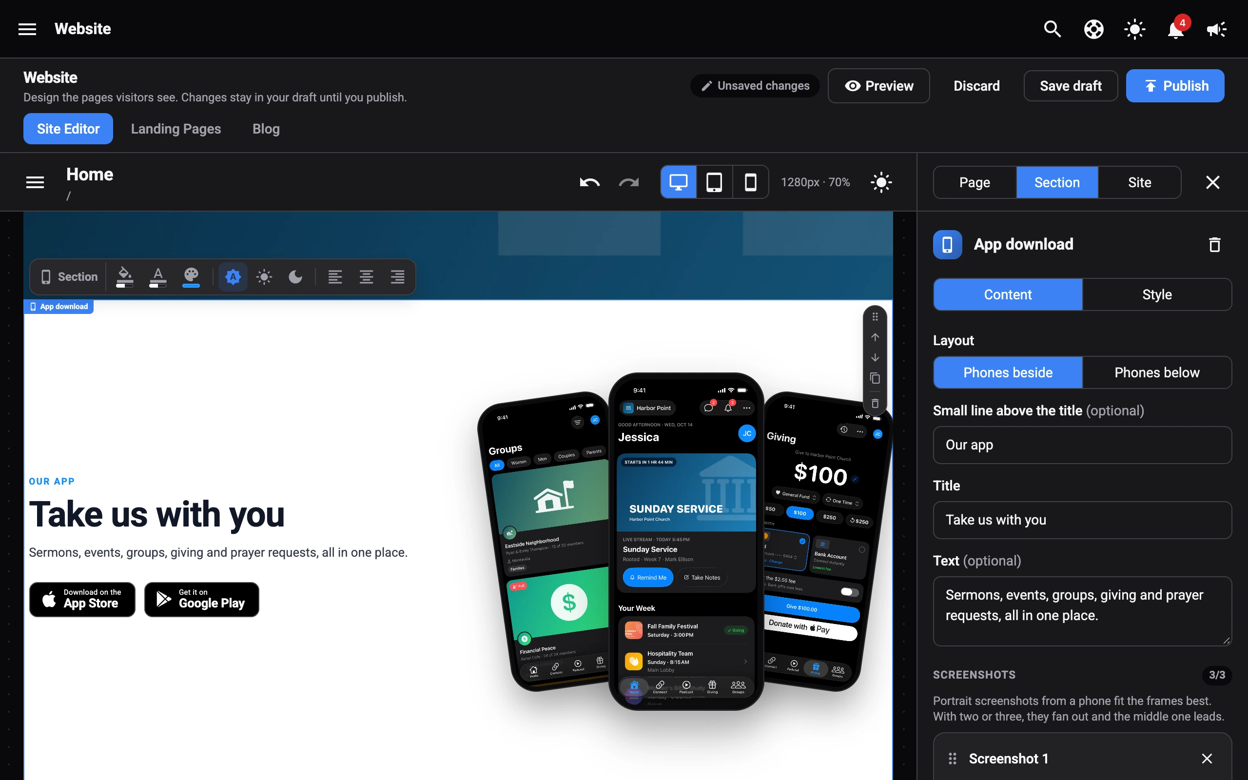
- Type the small line above the title (like Our app), the Title, and some text.
- Under Screenshots, select Add a screenshot. Portrait screenshots from a phone fit best. With two or three, they fan out and the middle one leads. Drag them to reorder.
- Pick a Phone frame: Black, White, or Silver.
- Under Store buttons, paste your App Store link and Google Play link. A button only shows when its link is set. Choose Black or White buttons.
Pick a Layout: Phones beside the text, or Phones below it. On tablets and phones, they stack.
Services & live
| Section | What it’s for |
|---|---|
| Service times | When and where you meet, with directions. Looks: Cards, List, Banner, Strip, Campus cards. |
| Countdown | Counts down to your next service or a big day. Looks: Boxes, Minimal, One line. |
| Live now banner | Appears when you go live, or counts down to your next stream. Looks: Bar, Card with thumbnail. |
Service times for several campuses
The Strip and Campus cards looks show several campuses (or Online), each with its own times. When you first switch to one, your current location and times become the first campus, and an Online campus is added for you.
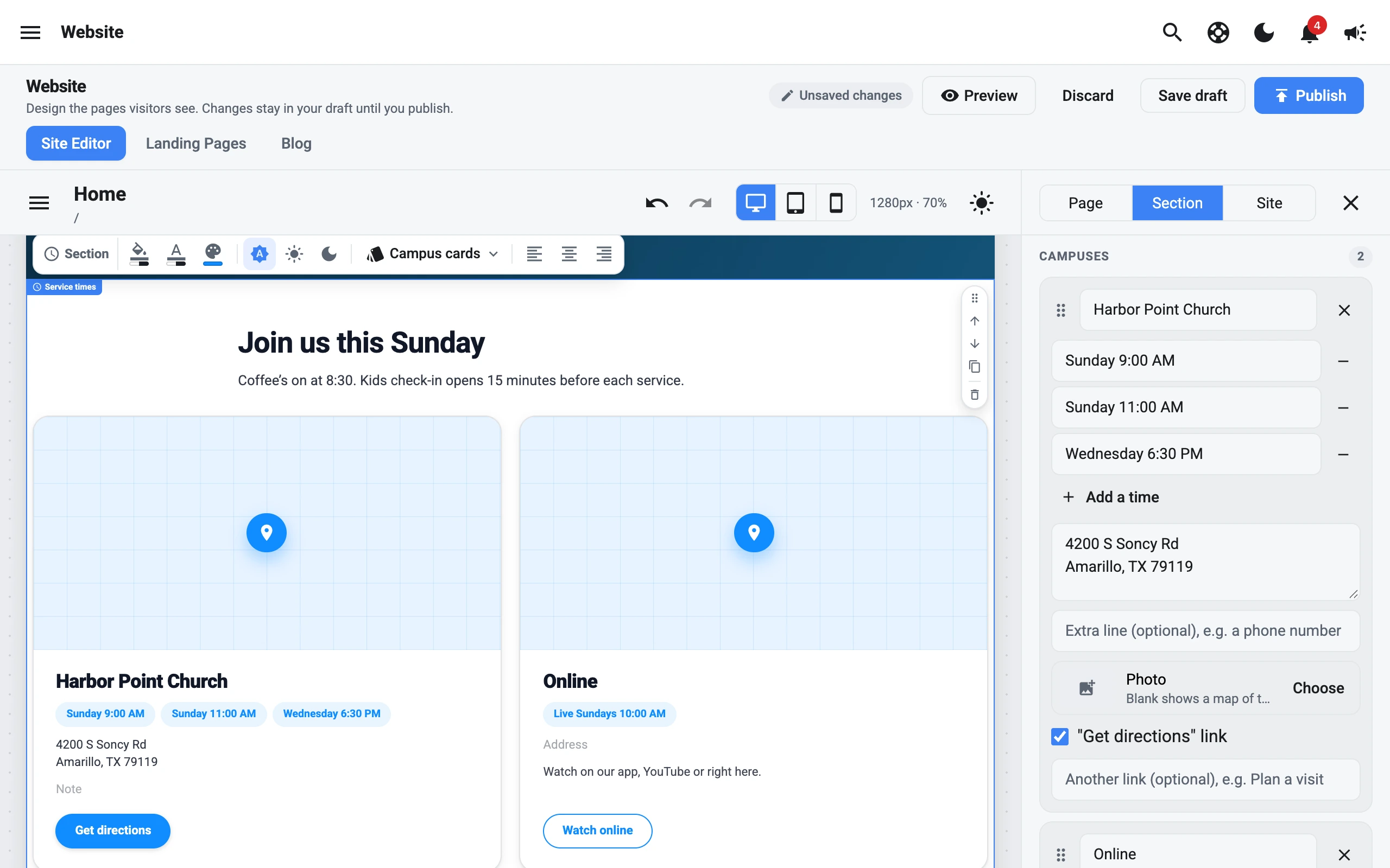
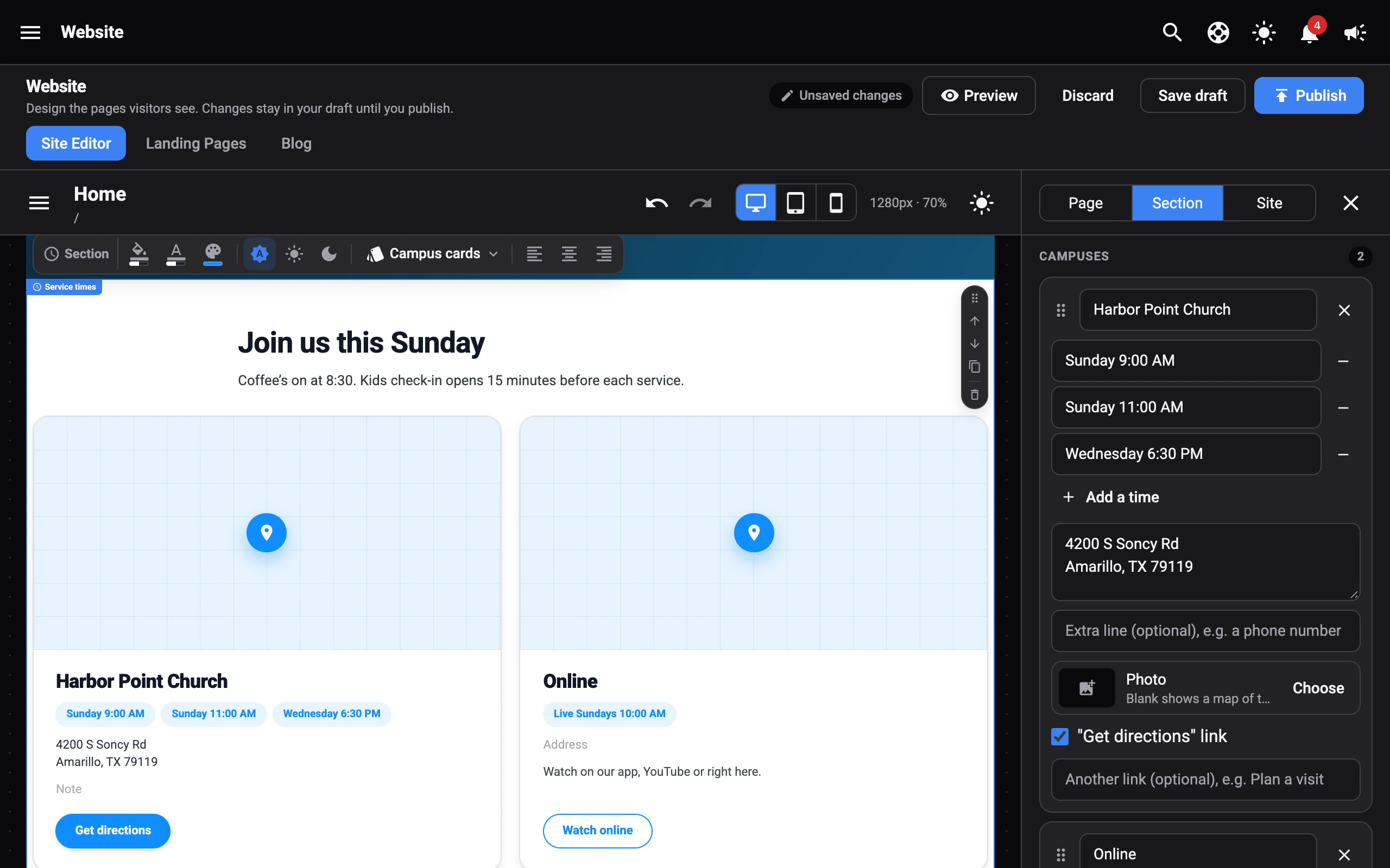
For each campus under Campuses:
- Its name, and its times. Select Add a time for more.
- An Address, and a “Get directions” link.
- An extra line, like a phone number.
- Another link, like Plan a visit.
- Strip: an icon, and Tinted to make one stand out (great for Online).
- Campus cards: a Photo. Leave it blank to show a map of the address.
Select Add a campus for more, and drag them to reorder.
Your content
These sections show what’s in your dashboard, so they update on their own.
| Section | What it shows |
|---|---|
| Events | Upcoming events. |
| Featured event | One event in the spotlight, as a Card, Banner, or Poster. |
| Announcements | Current announcements. |
| Blog posts | Your blog, with search and filters. |
| Groups | Groups people can join. |
| Connect | Connect opportunities. |
| Leadership | Your leadership team, as Cards, Circles, a List, or a Carousel. |
| Podcast episodes | Your latest episodes. |
| Podcast series | A grid of series artwork. |
| Worship | Worship recordings. |
| Calendar | Upcoming dates from your church calendar. |
| Store | Items people can order ahead from your store. |
Group finder
On a Groups section, turn on Group finder: Day and Area filters. Visitors can filter groups by the day they meet and the area they’re in. The filters are read from each group’s meeting time (like Tuesdays 7 PM) and address, and the cards lead with the meeting time.
Latest message
On a Podcast episodes section, turn on Latest message (newest only, large) to feature this week’s message with Watch now and Listen buttons. Add more buttons after them, like Past series.
Forms & giving
| Section | What it’s for |
|---|---|
| Contact us | Address, phone, email, times, a map, and a form. |
| Giving | Your online giving form, as Centered, Card, Split, or Banner. |
| Plan a visit | Let guests plan their first visit. |
| Guest form | Your guest or connection card. |
| Form | One of your custom forms. |
| Prayer request | Let people submit prayer requests. |
Embeds
| Section | What it’s for |
|---|---|
| Map | A map pinned to your location. |
| Embed page | Embed another web page. |
| Custom HTML | Your own HTML. |