
Style a section
Select a section on the canvas, then open the Section tab in the panel and select Style. Many of these settings are also on the quick-style bar above the section.
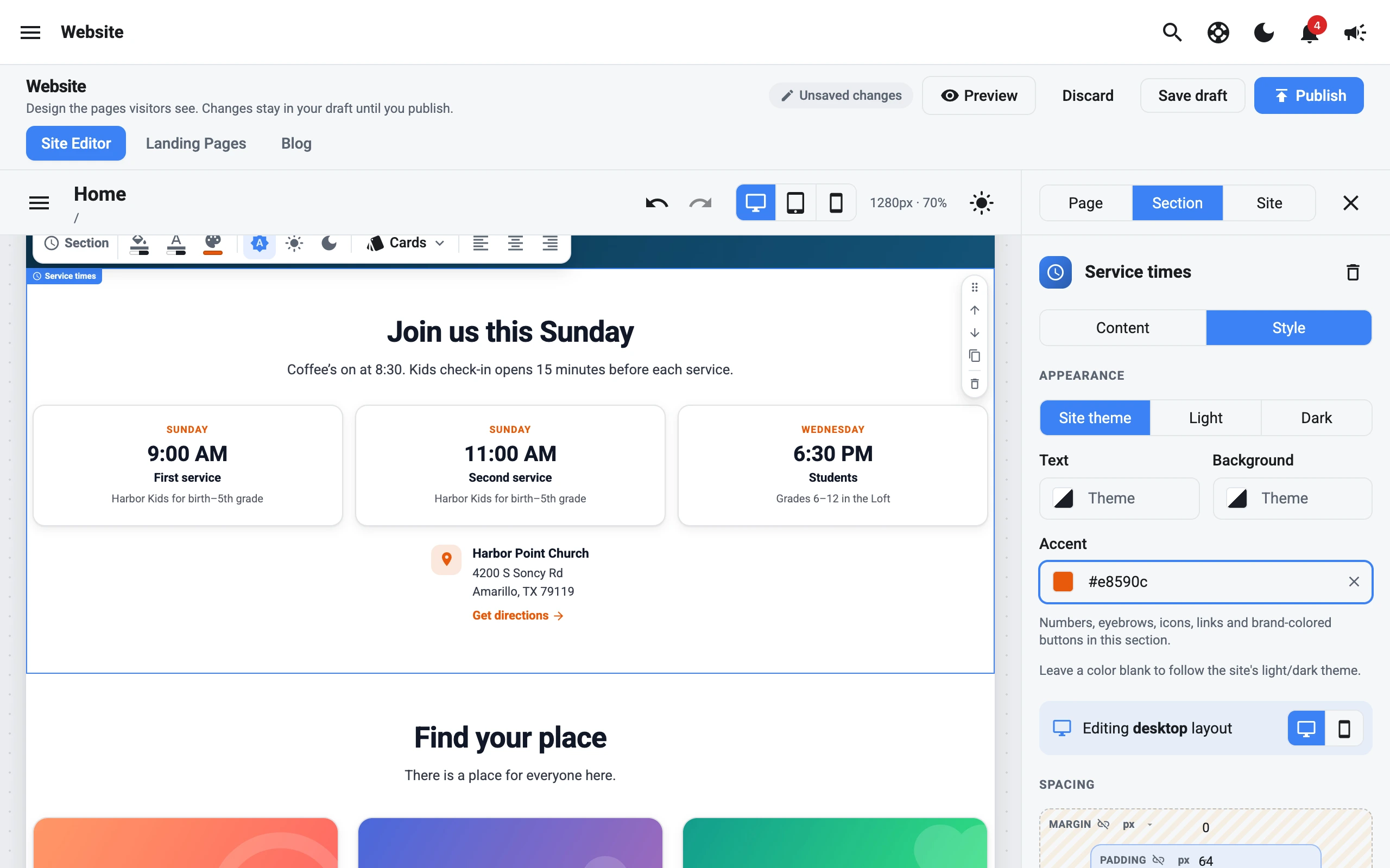
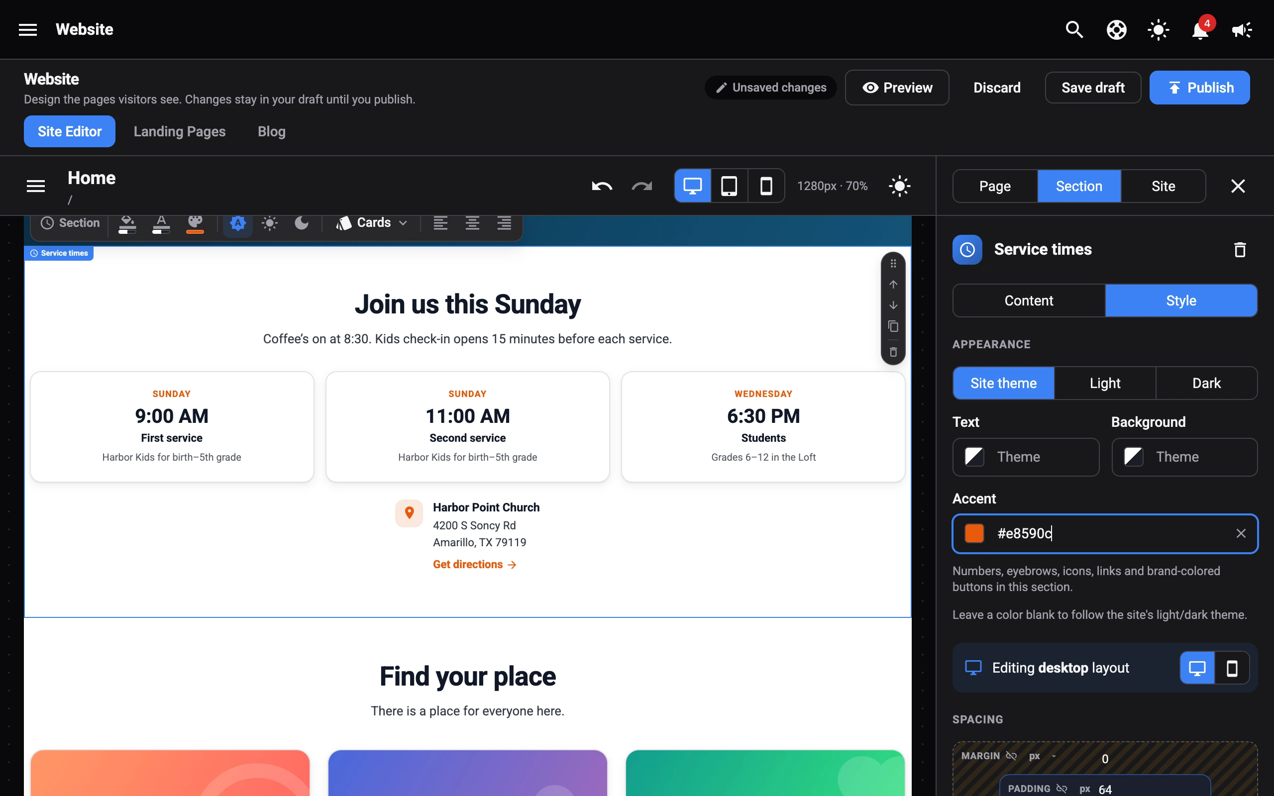
Appearance
- Site theme, Light, or Dark: whether the section follows your site’s theme or is always light or dark.
- Text and Background: the section’s own colours. Leave them blank to follow the site’s light or dark theme. The colour picker offers your Site colors first.
- Accent: the colour for numbers, eyebrows, icons, links, and brand-coloured buttons in this section. Leave it blank to use your brand colour. Hero and Heading sections set their eyebrow colour in Content instead.
If some text has its own colour from the text editor, the Text colour won’t change it. Select Reset text colors to clear those colours.
Desktop and mobile
Spacing, size, columns, and alignment can be different on desktop and mobile. Use the desktop and phone buttons at the top of these settings to choose which you’re editing. On mobile, blank fields use the desktop value. Select Reset to desktop to clear the mobile changes.
Spacing
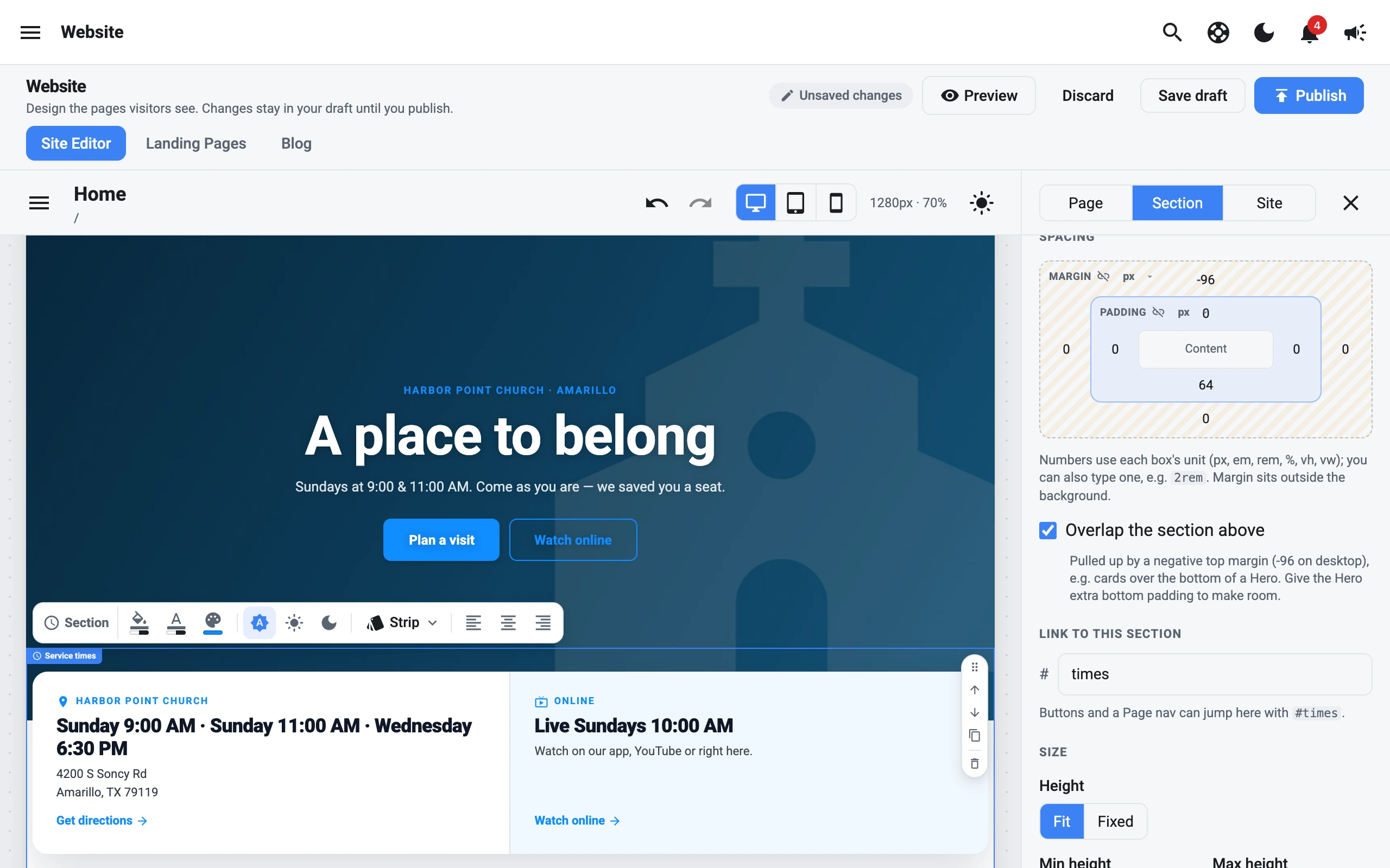
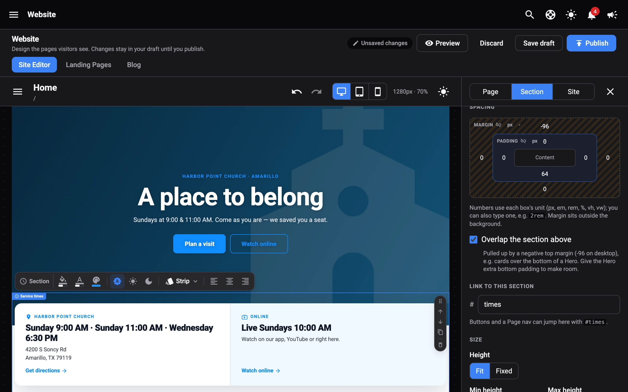
Set the Margin (outside the background) and Padding (inside it) for each side. Select the link button to change all sides together.
Numbers use the box’s unit (px, em, rem, %, vh, or vw). You can also type a unit, like 2rem.
Overlap the section above
Turn on Overlap the section above to pull the section up over the one before it, like a row of cards over the bottom of a Hero. It uses a negative top margin, which you can adjust.
Link to a section
Under Link to this section, give the section a short name, like leadership. Buttons and a Page nav can then jump straight to it with #leadership.
Size
Some sections let you set a Height (Fit or Fixed), plus a Min height, Max height, Min width, and Max width.
Heights include the padding. A max height hides what doesn’t fit. A narrower section is centred on the page.
Columns
Sections with columns can show them Side by side or Stacked, with Reverse order (or Swap image and text) and the Space between them. Set these separately for desktop and mobile.
Text alignment
Align the section’s text left, centre, or right. Leave it unselected to use the alignment set in the text editor. On mobile, it follows the desktop alignment unless you change it.
Visibility
Turn off Show on desktop & tablet or Show on mobile to hide the section on those screens.