
Edit on the page
You can do most editing on the canvas itself, without opening the side panel. Click a section to select it, then click its text to type, or use the quick-style bar that appears above it.
Type text on the page
Click any headline, line of text, or button label on the canvas and start typing. Your changes show in the Content tab too.
You can type right on the page in these sections:
- Hero and Heading: the small line above the title (the eyebrow), the title, and the subtitle.
- Buttons: the label of any site button, wherever it shows.
- Features, Stats, Timeline, FAQ, Testimonials, and Scripture.
- Service times, Countdown, and the Live now banner.
- App download and Page nav.
- Text, Image + text, and Header with text: these use the text editor, with its toolbar for bold, links, lists, fonts, and colours.
Optional text that’s empty, like a Hero’s eyebrow, shows a light placeholder while the section is selected. Type in it to add the text. Leave it empty and it won’t show on your site.
- Press ↵ or esc to finish typing.
- Pasted text comes in as plain text, so it picks up your site’s fonts.
- In an FAQ, clicking a question lets you edit it instead of opening the answer.
The quick-style bar
When you select a section, a small bar appears above it. When you click into some text, the bar moves just above that text. A label at the start of the bar shows what it’s styling: Section, Button, or Icon.
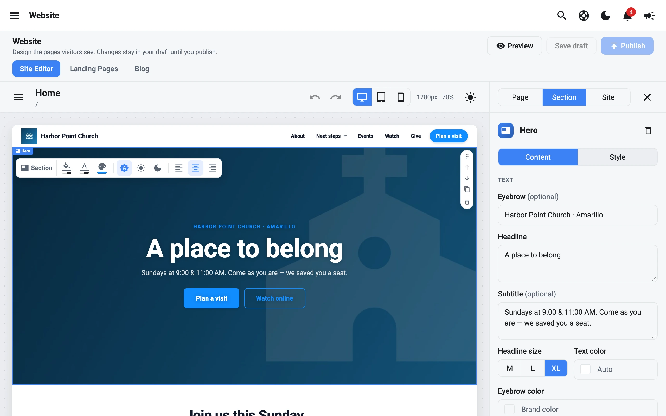
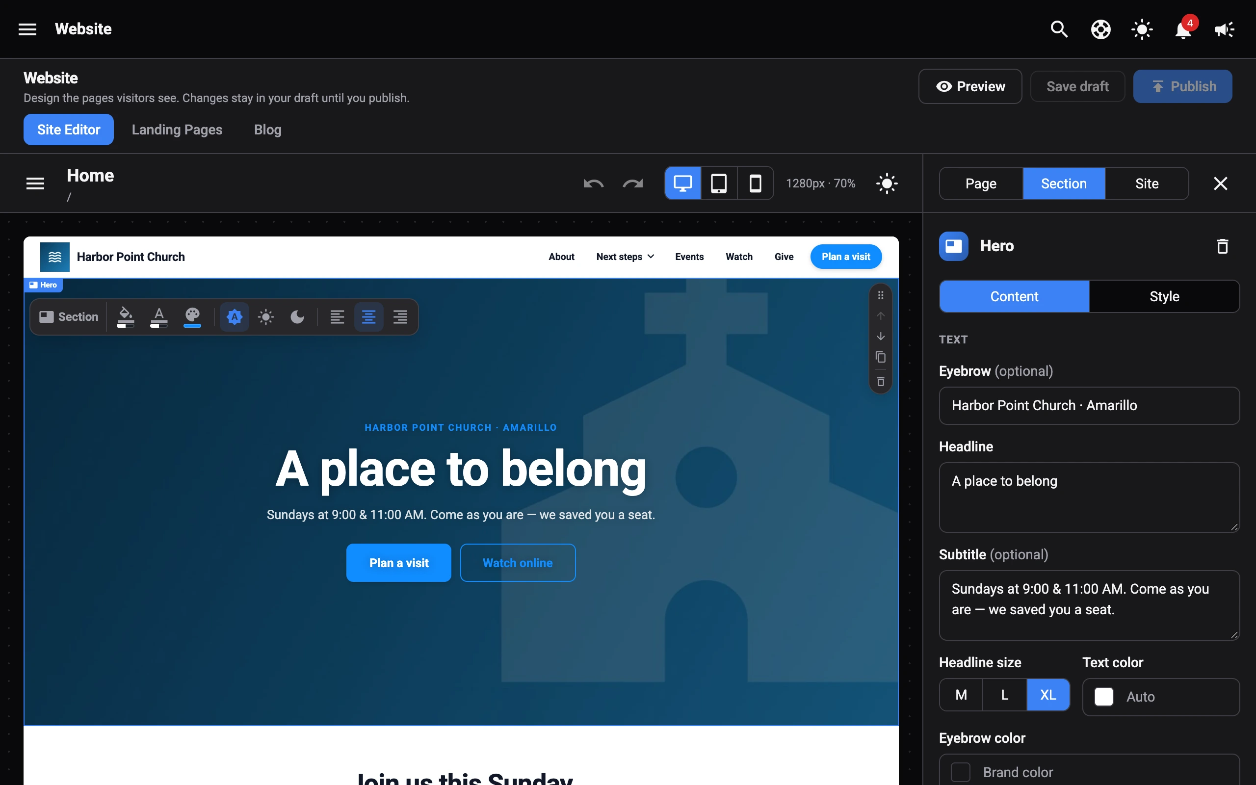
The bar changes the same settings as the Style and Content tabs, so the panel and Undo stay in step.
Style a section
With Section showing, you can change:
- Background color: pick one of your Site colors (your brand colour, page background, and theme colours) or any colour. Clear it to use the theme background.
- Text color: clear it to use the theme text colour. If some text has its own colour from the text editor, the tooltip tells you it keeps that colour.
- Accent color: the colour used for numbers, eyebrows, icons, links, and brand-coloured buttons in this section. In a Hero or Heading, this is the Eyebrow color. Clear it to use your brand colour.
- Light or dark: Follow the site theme, Light section, or Dark section.
- Look: switch the section’s layout, like Cards, List, or Banner. Only sections with more than one look show this.
- Text alignment: left, centre, or right. Click the active one again to go back to the alignment set in the text editor. On the phone canvas, this sets the mobile alignment only.
Style a button
Click a button in a Hero, Buttons, Call to action, Service times, Countdown, or Podcast episodes section. The bar switches to Button:
- Button color (or Border and text color for outline and link buttons). Clear it to use your brand colour.
- Button text color, for filled buttons. Clear it to use white.
- Filled, Outline, or Link.
- S, M, or L: the size of every button in that row.
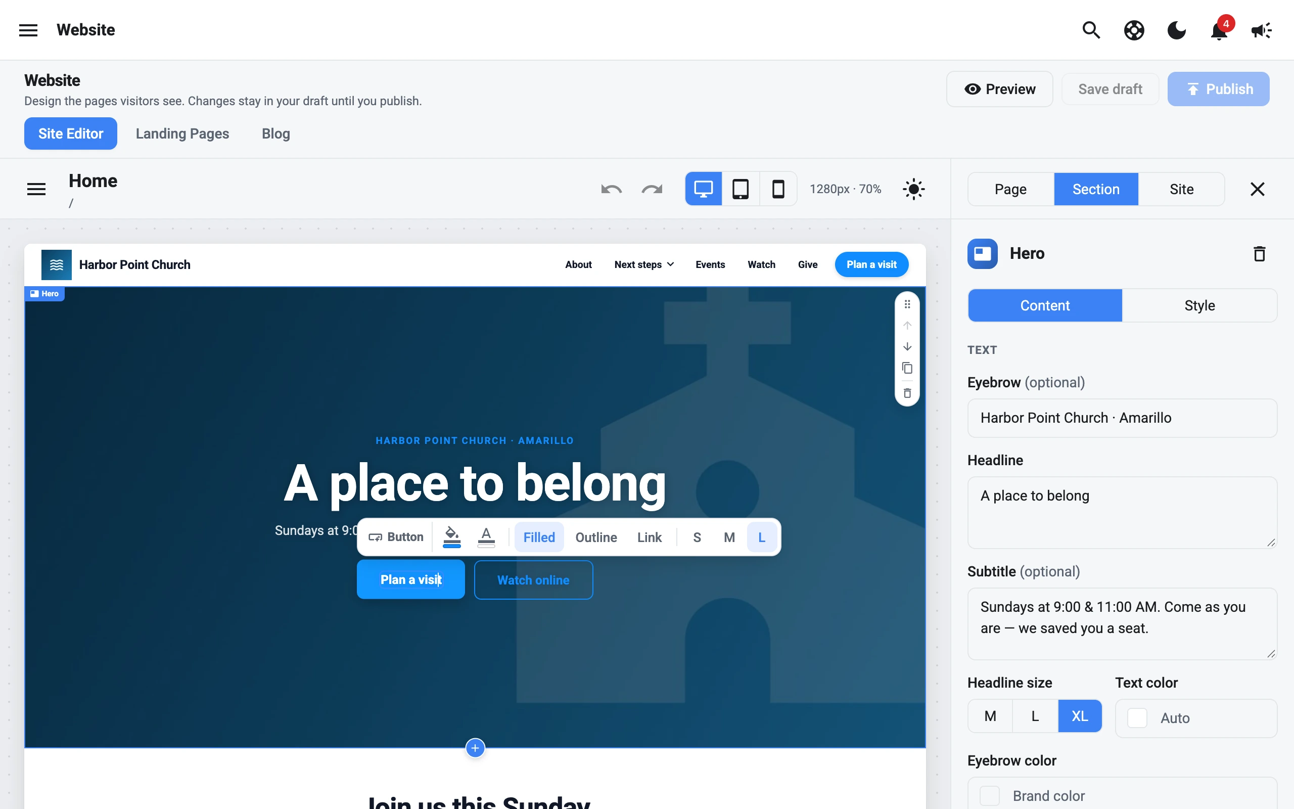
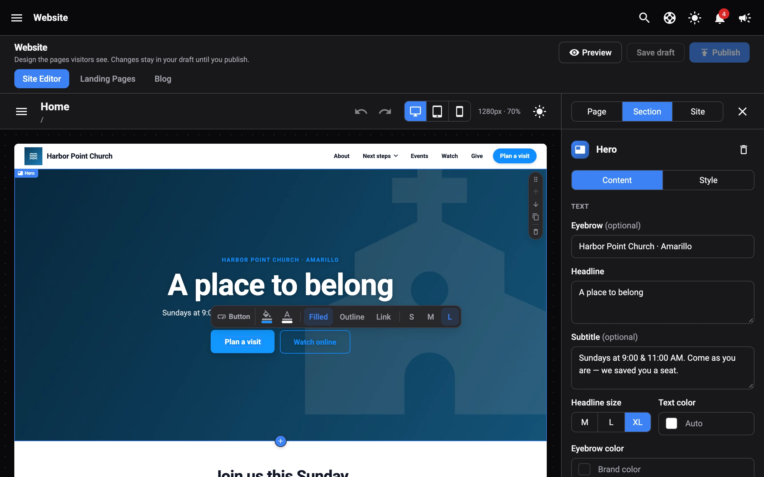
Some older buttons and links can’t be styled from the bar yet. When you click one, the bar hides. Use the Content tab instead.
Change an icon
Click an item’s icon in Features, Stats, or a Service times campus. The bar switches to Icon:
- Change: pick another icon from the same list as the Content tab.
- Accent color: tints the icons in the section.
To change how icons look across your site (tinted, circle, solid, outline, or plain), see Icons.