
Menu and footer
Your menu and footer show on every page. Click either one on the canvas, or open the Site tab in the panel and scroll to Menu bar or Footer.
Menu bar
- Layout: Classic, Logo left, Centered, or Floating.
- Logo: select Choose or Change, then pick a Logo size (S, M, or L). Turn on Show site name to show your site name beside it.
- Text and Background: leave them blank to follow the theme.
- See-through over the first section: great over a Hero. The menu fills in with its background once visitors scroll. Choose the Text while see-through colour (white unless you change it).
- Stay at the top while scrolling (when the menu isn’t see-through).
- Drop shadow.
- Show the Sign In button.
- Add a highlighted button, like Plan a visit or Give.
Menu links and dropdowns
Select Add a menu link to add a link to one of your pages or any web address. Drag links to reorder them.
To make a dropdown, select Add a sub-link on a link. You can also use a link’s More menu to Move into the dropdown above or Move out of the dropdown.
When you have a dropdown, pick a Dropdown style:
- List: a simple list of links.
- Detailed: each sub-link with an icon and a short description.
- Mega: a wide panel with several columns.
For Detailed and Mega, give sub-links an icon and a short description.
On phones
Choose how the menu opens from the menu button on phones: Dropdown, Side drawer, or Full screen. See it in Preview at phone size.
Bar above the menu
Turn on Add a bar above the menu for a thin strip of service times, a short note, or quick links.
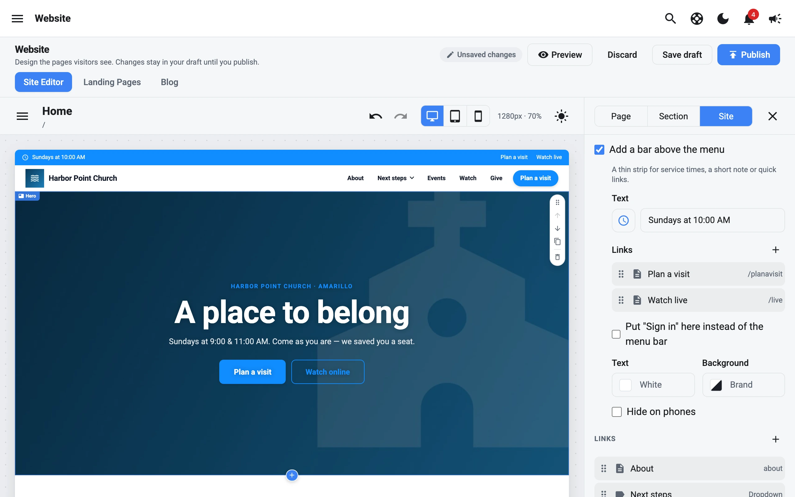
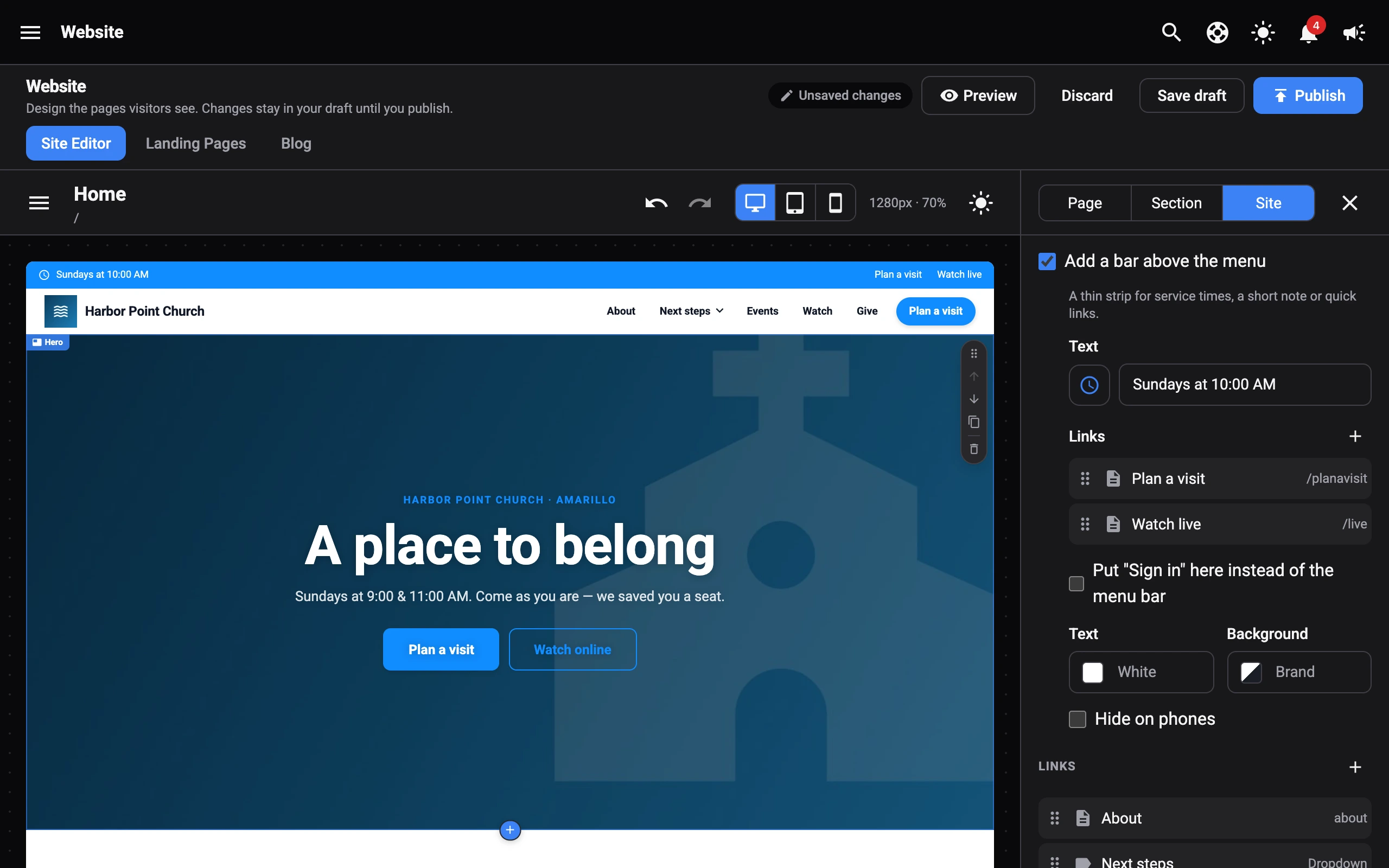
- Text: like Sundays 9:00 & 10:30 AM, with an optional icon.
- Links: show on the right. Drag them to reorder. They’re hidden on phones.
- Put “Sign in” here instead of the menu bar.
- Text and Background colours. The text is white and the background is your brand colour unless you change them.
- Hide on phones.
Footer
- Layout: Centered, Columns, Minimal, or Call to action.
- Call to action puts a Headline (like Plan your visit), optional text, and buttons in the footer.
- Logo: select Choose or Change.
- Show footer text: click the text in the footer on the canvas to edit it, like your address and service times.
- Text and Background colours.
Footer links
Turn on Show links in the footer, then choose:
- Match the top menu: loose links go under Explore, and each dropdown gets its own column.
- Custom columns: select Add column, give it a Column title, optional text (like an address and service times), and links. Drag links between columns. Columns show in the Columns and Centered layouts.
Social links
Your social links come from your organization’s social settings. Choose their Shape (Circle, Rounded, or Square) and Colors (Brand colors or Custom).
In the Centered layout you can also set the Position, the Direction (Row or Column), what to Show (Icon, Name, or Both), and the Icon size.